1 Digital Anarchy Data Storyteller
EDIT in Admin Edit in WPDownloads
Download demos and trial versions, product documentation, free presets and more.
You may download a free Demo after logging in.

Data Charts and Maps For Video
Are you trying to communicate data in your videos? Digital Anarchy’s Data StoryTeller plugin set makes it easy to turn data into animations in widely used video editing apps. With Data StoryTeller, you can easily explore large or small data sets to enhance the stories you’re telling. You no longer have to manually animate elements or attempt to wrangle a chart from Excel or another source not designed for video production. Data StoryTeller is the perfect companion for documentary video editors, news programs, commercials, and corporate work. All you have to do is plug the plugin into your video editing app of choice and let the data do the storytelling for you. With Digital Anarchy’s Data StoryTeller, you can easily and quickly turn data into powerful animated stories.
Digital Anarchy Data Storyteller Demo Reel
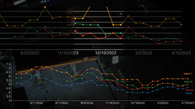
In particular, Data Storyteller makes it easier to animate large data sets or data sets across multiple files (e.g. years, countries, etc). Of course, Data StoryTeller effortlessly animates basic charts but also excels with some larger data sets. In fact, they often are incredibly interesting and beautiful when the visualization is animated.
Data Storyteller Charts and Data Storyteller Maps integrate with After Effects, Premiere Pro, Resolve, and Final Cut Pro.
The data visualizations generate as vector-based graphics. In other words, renders can be scaled to any size, including HD, 4K, 8K, 12K, or higher.

Complex data visualizations made simple
You can upload Excel or CSV files, select a chart type, and animate one – or multiple – data sets with minimum effort. Data Storyteller simplifies data visualization, from the creation of basic animated charts to much more complex visualizations that use large data sets and multiple files. There’s no need to be a data scientist to create interesting and clear animations/visualizations for video productions!

Charts and Maps setup from scratch or from a template
Select from five charts: Bar, Line, Scatter/Bubble, US Map, and World Map. Setting up your chart works much like creating graphics in Excel or Apple Numbers. To explain, after uploading a file, users can choose:
- what data to include in the animation
- how the color or size of the data elements change
- how elements animate on/off
- transition effects
- position on screen
- and more
A new way to tell better stories with data
Digital Anarchy designed Data Storyteller with video editors in mind. Indeed, editors will find it perfect for documentary filmmaking, marketing, corporate, or social media. Good data visualization can add a powerful element to your productions, no matter what kind of stories you’re telling. Charts and Maps that change over time, reflecting the underlying data, can almost tell a complete story by themselves… all without leaving your NLE!

Two plugins that integrate with all professional video editing apps
Data Storyteller Charts and Data Storyteller Maps are both part of the Data Storyteller package. It supports the most widely used professional editing platforms – Final Cut Pro, Adobe Premiere Pro or After Effects, and Da Vinci Resolve. This integration makes it easy to apply changes and show the animations in your production. In other words, you won’t need to export/import files back and forth.
Description
Explore large data sets, or multiple data sets, with animation
Data Storyteller was designed with video editors in mind. It substantially simplifies the creation of animated charts and map visualizations for After Effects, Premiere Pro, Resolve, and Final Cut Pro. From small to large data sets, Data Storyteller’s Maps and Charts plugins have all the options you need to create stunning data-based animations. Designed from the ground up for video production, your animations can be created in much less time than traditional data visualization tools.
There are many sets of controls available to select, format, and display your animated data exactly the way you want!
World and US Maps
Visualize world data (countries) or US data (states and counties). Use names or FIPS to link data to regions on the maps. The World Map offers different projections, including a 3D globe.
Traditional Charts
Create Bar, Line, and Scatter/Bubble charts. Because Data Storyteller is built on the robust charting library of D3.js, we will continually be adding other types of charts after the 1.0 release.
Automated or Manual Animation
You can create animations by setting a few parameters, such as Draw On Time or Fade Off. Or you can manually keyframe many settings for more complex animations that are timed to the rest of your production.
Simple or Complex data handling
Imported CSV or Excel files can be simple spreadsheets or more complex, with multiple sheets or large data sets. Users can also export/import Json files to use the same data settings, visuals, and titles/legend choices in their next graphic.
Built-in Spreadsheet and data reload mechanism
A built-in spreadsheet to see and select all of the data or highlight specific cells, rows, and columns you wish to include in your visualization. You can see all your data inside of the app and use the “Reload Files” button to refresh the in-app content after editing the data in a spreadsheet app.
Single and Multi-file data animation options
upload one or multiple data sets and choose how your data will be animated on the screen in both cases. Data Storyteller has two panels dedicated to setting how you want your data to play on the screen, allowing users to apply video transitions, control the animation interval time, select Fade or Draw, and more.
Range/Filter Animation
choose to slowly reveal or hide data by keyframing the spreadsheet selection or filtering values that are higher or lower than a user-defined threshold. By using keyframes that determine when and where each new data point appears, it is possible to create animations that are timed to other aspects of your production for more impact.
Map Data Values to Color, Size, Position, US Map, and World Map
Data values can affect many aspects of the Charts and Maps, allowing you to create interesting visualizations that connect with your viewers.
Preset Templates and Test Files
A wide variety of templates help users get started on creating beautiful data visualizations. Data Storyteller also offers built-in test files: simply choose one of the data sets available to try the plugin. There’s no need to have your own spreadsheet setup to get started.
System Requirements
OS Support
- Windows 10 and later
- macOS High Sierra and later, macOS 11 and later
- Supports Intel and Silicon Chips on Mac
Host Support
- Premiere Pro and After Effects 2023
- Final Cut Pro X 10.6
- DaVinci Resolve Resolve 18


'%3e%3cg id='Final-Copy-2_2_' transform='translate(1275.000000, 200.000000)'%3e%3cpath class='st0' d='M7.4,12.8h6.8l3.1-11.6H7.4C4.2,1.2,1.6,3.8,1.6,7S4.2,12.8,7.4,12.8z'/%3e%3c/g%3e%3c/g%3e%3c/g%3e%3cg id='final---dec.11-2020'%3e%3cg id='_x30_208-our-toggle' transform='translate(-1275.000000, -200.000000)'%3e%3cg id='Final-Copy-2' transform='translate(1275.000000, 200.000000)'%3e%3cpath class='st1' d='M22.6,0H7.4c-3.9,0-7,3.1-7,7s3.1,7,7,7h15.2c3.9,0,7-3.1,7-7S26.4,0,22.6,0z M1.6,7c0-3.2,2.6-5.8,5.8-5.8 h9.9l-3.1,11.6H7.4C4.2,12.8,1.6,10.2,1.6,7z'/%3e%3cpath id='x' class='st2' d='M24.6,4c0.2,0.2,0.2,0.6,0,0.8l0,0L22.5,7l2.2,2.2c0.2,0.2,0.2,0.6,0,0.8c-0.2,0.2-0.6,0.2-0.8,0 l0,0l-2.2-2.2L19.5,10c-0.2,0.2-0.6,0.2-0.8,0c-0.2-0.2-0.2-0.6,0-0.8l0,0L20.8,7l-2.2-2.2c-0.2-0.2-0.2-0.6,0-0.8 c0.2-0.2,0.6-0.2,0.8,0l0,0l2.2,2.2L23.8,4C24,3.8,24.4,3.8,24.6,4z'/%3e%3cpath id='y' class='st3' d='M12.7,4.1c0.2,0.2,0.3,0.6,0.1,0.8l0,0L8.6,9.8C8.5,9.9,8.4,10,8.3,10c-0.2,0.1-0.5,0.1-0.7-0.1l0,0 L5.4,7.7c-0.2-0.2-0.2-0.6,0-0.8c0.2-0.2,0.6-0.2,0.8,0l0,0L8,8.6l3.8-4.5C12,3.9,12.4,3.9,12.7,4.1z'/%3e%3c/g%3e%3c/g%3e%3c/g%3e%3c/g%3e%3c/svg%3e) Your Privacy Choices Notice at Collection
Your Privacy Choices Notice at Collection